Creating a Better Food Delivery Mobile Website
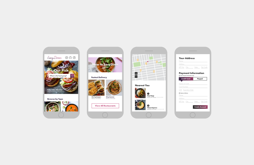
When it comes to ordering food delivery online there are many options that users can choose from, however each site has its own disadvantages and no option is perfect.This is an identity, system, and mobile site design for a better experience when ordering food delivery from a mobile device.
Role: User Research, UX Strategy, Branding, UI Design, Testing, Prototyping
The Process
Research
Analyze
Design
Test
Research: Competition Analysis
Before starting anything else, I began with an analysis of the other food delivery and takeout mobile sites. My goal was to get a better understanding the competition and the strengths and weaknesses of each, as well as the similarities and differences. After this analysis, I decided to create a mobile site that would minimize the number of pages a user would have to navigate from start to finish, as well as create forms that were both beautiful and easy to use.
Research: Empathy Research
After analyzing the competition, I surveyed people in the targeted demographic to further understand their behaviors when ordering food online from mobile devices. Based on the interviews, I broke down their answers into two categories, what the EasyDiner mobile site should pursue and what it should avoid.
Pursue
Convenience, Ease of Use, Consistency of Styles, Ability to Track Food, Multiple Points of Entry for Food Browsing.
Avoid
Too Many Screens from Start to Finish, Clunky Forms.
Analyze: User Persona & Empathy Mapping
After talking to the targeted demographic and listening to their wants and needs, I created a user persona and empathy map of a typical user of the EasyDiner mobile site.
Design: User Flow
Before any wireframes or pages were designed, I first created a user flow for browsing by food type on the EasyDiner.com mobile site. This flow was chosen based on the results from my empathy research on how the targeted demographic usually browses for food on delivery sites.
Design: Wireframes
Following the flows, I began to layout basic wireframes for the EasyDiner.com mobile site.
Design: Identity
Before further developing the wireframes, I then started to work on the identity for the EasyDiner.com mobile site. I decided to use the diner reference and explored neon signs and other signage often seen in diners.
Design: Final Identity
I decided to use the first option for the final identity, and used a gradient color blend to reference the glow of a neon light.
Design: Prototype and Higher Fidelity Wireframes
I then further developed the wireframes, and created a desktop prototype for the mobile site.
Design: UI Kit
Finally, I created a UI kit including all the elements a developer may need to build the EasyDiner.com site.
Test
Once the prototype was built, I conducted usability testing among EasyDiner’s targeted demographic to gain insights on the design, and learn how my expectations and assumptions were similar to the users, and where they differed. Based on the results from the usability testing, I created an affinity map to show the hierarchy of both successes as well as changes to be implemented.
Reflection and Next Steps
Once a site is created and the user experience is tested, further changes are made and those changes are subject to further testing. The user experience is continually updated and shaped based on user testing and feedback. A design is never truly finished, and lives in the space between the design and testing stages of the UX process. Further testing of the site will determine what features and changes are needed.


