Designing a Responsive E-Commerce Website
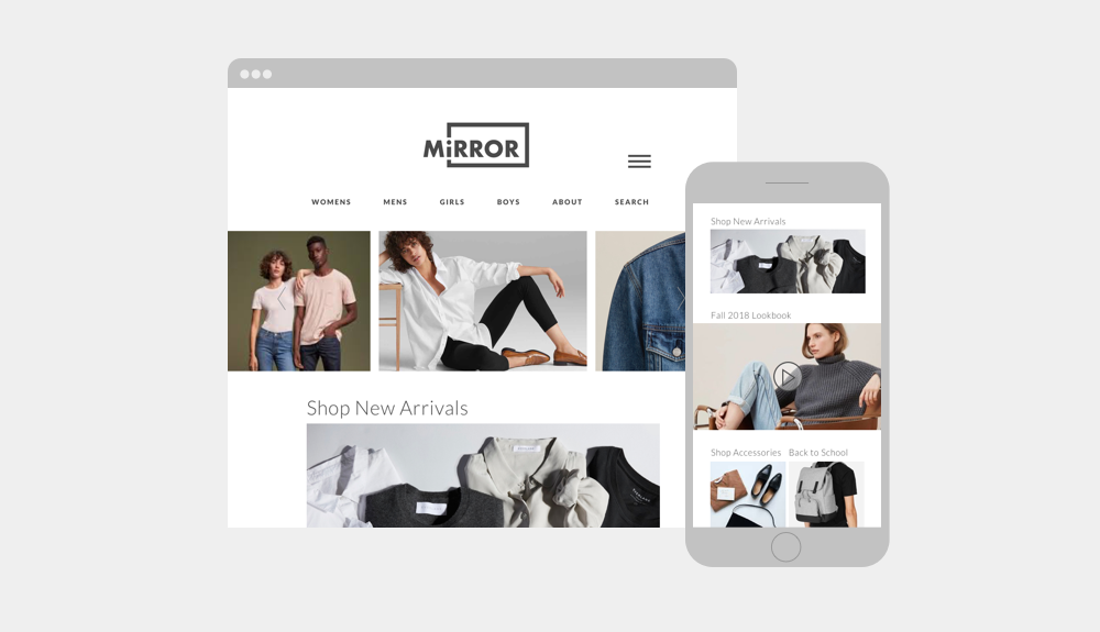
This is an identity, system, and responsive e-commerce site design for a hypothetical clothing company, Mirror. According to the brief, Mirror is a successful brick-and-mortar clothing brand but has never had an online presence. In addition to creating the brand’s first e-commerce site, they also needed an updated identity to speak to their “Clothing for Everyone” ethos.
Role: User Research, UX Strategy, Branding, UI Design, Testing, Prototyping
The Process
Research
Analyze
Design
Test
Research: Competition Analysis
The first step in the design process is understanding the competition. Mirror has had a successful business model for their physical stores, but has never had an online presence. In order to translate their existing successes into successes online, I first looked at major and secondary competitors’ websites to assess their strengths and weaknesses, as well as their similarities and differences.
Research: Empathy Research
After analyzing Mirror’s competition, I surveyed several people in Mirror’s targeted demographic to further understand their online shopping habits and their thoughts on successful online shopping experiences. Based on the interviews, I broke down their answers into two categories, what the Mirror site should pursue and what it should avoid.
Pursue
Convenience, Ease of Use, Free Shipping, Consistency of Styles, Consistency of In-Store to Online Experience, Variety of Inventory
Avoid
Excessive Filtering, Clunky UI, Inventory Overload
Analyze: User Persona & Empathy Mapping
After talking to the targeted demographic and listening to their wants and needs, I created a user persona and empathy map of a typical user of the Mirror online site.
Analyze: Storyboarding
Based on the persona, I created an empathy map and storyboard for a typical Mirror user.
A Typical Monday for Hannah
Hannah’s son is sick, she and her husband are up all night caring for him. She doesn’t make it to the gym before work. While commuting to work, traffic is bad, and it takes her over an hour to travel only a few miles. Once she arrives, she sees that her day will be mostly comprised of meetings that she is either leading or required to attend. She cannot take a lunch hour, but instead eats at her desk. A friend at her office is wearing a new dress and Hannah comments that she likes it. Her friend tells her to go to Mirror.com to find something similar. After the long day, she commutes back home and sits in traffic for another hour. She is exhausted, but once she is there she has to prepare dinner for her family while her husband cares for their sick son. Eventually, she gets some time for herself and goes to mirror.com to look for a dress. The UI is easy to navigate, and she quickly finds one she likes. The price is good, and it can arrive before Friday. Excited, she buys it. Hannah then gets to bed on time and hopes to sleep through the night and go to the gym in the morning.
Design: User Flows and Task Flows
Before any wireframes or pages were designed, I first created user flows and task flows for typical Mirror.com users. I created user flows for 3 archetypes of Mirror’s users, a buyer who knows exactly what they are looking for, a browser, and a bored shopper. Once userflows were developed, I mapped out a taskflow for a typical Mirror.com purchase.
Design: Wireframes
Following the flows, I began to layout basic wireframes for the desktop and mobile site.
Design: Identity
Before further developing the wireframes, I then started to work on the identity for the Mirror site. The existing identity mark was outdated and didn’t speak to the aspirations of the growing brand. The new identity had to speak to Mirror’s “clothing for everyone” ethos. I started by first sketching some rough ideas for the identity mark. I explored wordmarks, monograms, and symbols and in order to decide how best to represent the Mirror brand.
Design: Final Identity
The final Identity references the shape of a mirror and sits on a single line—ideal for viewing on mobile devices.
Design: Prototype and Higher Fidelity Wireframes
I then further developed the wireframes, and created a desktop prototype for the e-commerce site.
Design: UI Kit
Finally, I created a UI kit including all the elements a developer may need to build the Mirror site.
Test
Once the prototype was built, I conducted usability testing among Mirror’s targeted demographic to gain insights on the design, and learn how my expectations and assumptions were similar to the users, and where they differed. Based on the results from the usability testing, I created an affinity map to show the hierarchy of both successes as well as changes to be implemented.
Reflection and Next Steps
Once a site is created and the user experience is tested, further changes are made and those changes are subject to further testing. The user experience is continually updated and shaped based on user testing and feedback. A design is never truly finished, and lives in the space between the design and testing stages of the UX process. Further testing of the site will determine what features and changes are needed.


